Introduction to Matplotlib - Visualization with Python#
Matplotlib is a Python library for creating plots and visualizations (static, animated and interactive).
In this notebook, we will go through some of the basics to get you started – BUT – there are many many more opportunities.
You will need to explore those on your own and as relevant to the particular needs of your work.
IMPORTANT
Go through the code step-by-step to understand what is going on
Every time you see a new Python/Matplotlib function/keyword - look up the documentation online and try out how it works
Much more information and many more examples can be found here
# Step 1 - import the matplotlib library and give it a short name
import matplotlib.pyplot as plt
from datetime import datetime # <--- additional library that we are going to use for an challenge in the end

# Numpy arrays great for plotting numbers, so we will import that as well
import numpy as np
Intel MKL WARNING: Support of Intel(R) Streaming SIMD Extensions 4.2 (Intel(R) SSE4.2) enabled only processors has been deprecated. Intel oneAPI Math Kernel Library 2025.0 will require Intel(R) Advanced Vector Extensions (Intel(R) AVX) instructions.
Intel MKL WARNING: Support of Intel(R) Streaming SIMD Extensions 4.2 (Intel(R) SSE4.2) enabled only processors has been deprecated. Intel oneAPI Math Kernel Library 2025.0 will require Intel(R) Advanced Vector Extensions (Intel(R) AVX) instructions.
Let’s start by plotting a sine function#
The function:
\(f(x) = y = \sin(x)\)
So, what do we need?#
A set of x-values covering the range of interest
Evaluate the function at these x-values
Plot the function values against the x-values
Save the plot as a figure
# Step 1 - Usese numpy linspace to create an array of 100 evenly spaced x-values from 0 to 2*pi.
xvalues = np.linspace(0, 2 * np.pi, 100)

# Step 2 - Use this array, we evaluate the function values
yvalues = np.sin(xvalues)

# Step 3 - Use the matplotlib.pyplot plot function to plot the x-values and associated y-values as a line
plt.plot(xvalues, yvalues)

# Step 4 - Save the plot as a png figure with name sine_plot
plt.savefig("sine_plot.png", dpi=300)
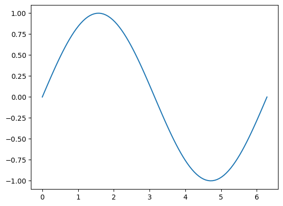
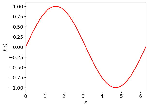
Now this is not very pretty.#
Beautification
We forgot axis labels
We only want to show the plot for the range of x-values used
We want the plotted line to be red instead of blue, and it also needs to be a big thicker
We want the fonts to be bigger - both axis and tick labels
# Change line width and color
plt.plot(xvalues, yvalues, linewidth=2, color="red")

# Add axis labels and adjust their fontsize
plt.xlabel(r"$x$", fontsize=14)
plt.ylabel(r"$f(x)$", fontsize=14)

# Change size of the tick labels
plt.tick_params(axis="both", labelsize=14)

# Adjust plot range
plt.xlim([0, 2 * np.pi])

# Save the plot as a png figure with name sine_plot_beautified
# The file extention (.png, -jpb, .pdf) give the respective format of the figure. The resolution can be indicated using dpi.
plt.savefig("sine_plot_beautified.png", dpi=300)
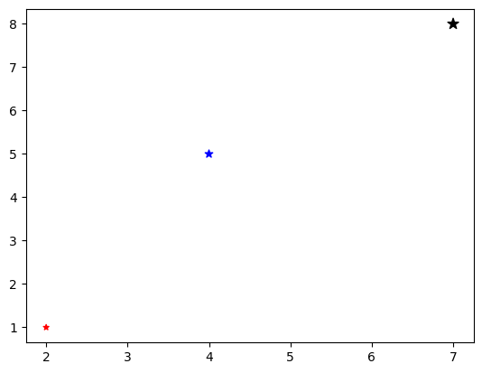
If you have a series of (x, y) values, you can also plot them as separate points using matplotlib.pyplot scatter#
# This time I use a list just to show you that the inputs can be any float or array-like object
xvalues = [2, 4, 7]
yvalues = [1, 5, 8]

colors = ["red", "blue", "black"]
sizes = [20, 40, 80]

plt.scatter(xvalues, yvalues, c=colors, marker="*", s=sizes)
<matplotlib.collections.PathCollection at 0x7f92218208b0>
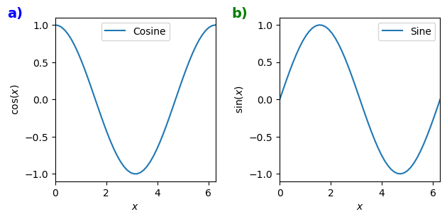
Several subplots#
We can also make several plots in a figure by using the matplotlib.pyplot subplots function.
Let’s see an example below where we plot cosine in a plot to the left and sine in a plot to the right.
# Defining the x-values
xvalues = np.linspace(0, 2 * np.pi)

# Evaluating y-values
cosine_values = np.cos(xvalues)
sine_values = np.sin(xvalues)

# Create a figure and two subplots (one row, two columns) and unpack the output subplot array immediately (in ax1 and ax2)
# Also adjust the figure size to our liking
fig, (ax1, ax2) = plt.subplots(nrows=1, ncols=2, figsize=(7, 3))

# Plot cosine values in the first subplot
ax1.plot(xvalues, cosine_values, label="Cosine")

# Plot sine values in the second subplot
ax2.plot(xvalues, sine_values, label="Sine")

# Add axis labels (note the additional set_ in set_xlabel when you are working on axis objects instead of plt)
ax1.set_xlabel(r"$x$")
ax1.set_ylabel(r"$\cos(x)$")
ax2.set_xlabel(r"$x$")
ax2.set_ylabel(r"$\sin(x)$")

# Add plot legends
ax1.legend()
ax2.legend()

# Adjust plot range
ax1.set_xlim([0, 2 * np.pi])
ax2.set_xlim([0, 2 * np.pi])

# To remove overlap between plots and labels
plt.subplots_adjust(wspace=0.4)

# Label the subplots with a) and b) for easier referencing when used as a figure in a publication
# The transform = ax.transAxes allows you to position the text by coordinates relative to the exes on a scale from 0 to 1.
# If you do not provide this argument, the text function will assume the actual coordinates

ax1.text(
    -0.3, 1, "a)", fontsize=14, fontweight="bold", color="blue", transform=ax1.transAxes
)
ax2.text(
    -0.3,
    1,
    "b)",
    fontsize=14,
    fontweight="bold",
    color="green",
    transform=ax2.transAxes,
)
Text(-0.3, 1, 'b)')
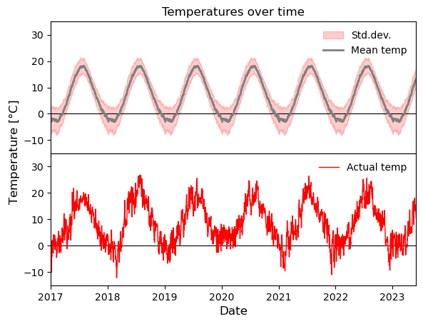
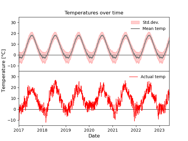
Matplotlib Challenge#
Now it is your turn.
Below is a figure based on some data. Provided this data, your task is to reproduce the figure as closely as possible.
The example data is a truncated set of historical weather data from Stockholm, retrieved from the Bolin Centre for Climate Research, Stockholm University.
Take notice of the following features
2 subplots with shared x-axis
y=0 degrees line in both plots
legend in top right corner showing the plotted labels without a frame
Title in plot
Centered y-axis label
No distance between plots
Top plot:
fill between the average time of year (toy) +/- the std.dev. temperature
Plot of the average time of year (toy) temperature
No x-tick labels
Bottom plot:
Plot the daily mean temperature
There is some starter code that loads the data in the cell below the plot.
# --------------------------------------------
# Plotting task starting code
# Loading the data and fixing the data types
# --------------------------------------------
data = np.loadtxt(
    "stockholm_daily_mean_avg_std_temperature.csv",
    delimiter=",",
    usecols=(0, 1, 2, 3),
    skiprows=1,
    dtype=object,
    converters={
        0: lambda x: datetime.strptime(x.decode(), "%Y-%m-%d"),
        1: float,
        2: float,
        3: float,
    },
)
dates = data[:, 0]
daily_mean = data[:, 1].astype(float)
avg_toy = data[:, 2].astype(float)
stddev_toy = data[:, 3].astype(float)
# --------------------------------------------

fig, (ax1, ax2) = plt.subplots(2, 1)
fig.text(
    0.02,
    0.5,
    r"Temperature [$\degree$C]",
    ha="center",
    va="center",
    rotation=90,
    fontsize=12,
)

x_values = np.arange(len(data[:, 0]))

ax1.set_title("Temperatures over time")
ax1.axhline(y=0, color="k", linewidth=0.8)
ax1.fill_between(
    dates,
    avg_toy - stddev_toy,
    avg_toy + stddev_toy,
    color="r",
    alpha=0.2,
    label="Std.dev.",
)
ax1.plot(dates, avg_toy, "grey", linewidth=2, label="Mean temp")
ax1.legend(frameon=False, loc="upper right")
ax1.set_ylim([-15, 35])
ax1.set_xlim([datetime(2017, 1, 1), datetime(2023, 6, 1)])
ax1.xaxis.set_ticklabels([])

# # Plot the actual data
ax2.axhline(y=0, color="k", linewidth=0.8)
ax2.plot(dates, daily_mean, "r", linewidth=1.0, label="Actual temp")
ax2.legend(frameon=False, loc="upper right")
ax2.set_ylim([-15, 35])
ax2.set_xlim([datetime(2017, 1, 1), datetime(2023, 6, 1)])
ax2.set_xlabel("Date", fontsize=12)
plt.subplots_adjust(left=0.1, hspace=0)
plt.savefig("daily_avg_temperature.png")


# Hint for xlims
# plt.xlim([datetime(2017, 1, 1), datetime(2023, 6, 1)])